Needing an attention getter!
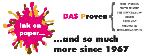
Monday, November 16th, 2009For nearly our entire 40+ year history the same logo, fonts and colors have been a constant part of the image of David A. Smith Printing. Although they have become readily identifiable with our company and they anchor our marketing efforts, we felt that it was time to incorporate a new attention getter into our brand awareness. Enter “the splotch”…
We needed a simple graphical element that could be used with our logo and colors in print, billboard, vehicle, and magazine/newsprint advertising that stood out and got people’s attention (Note… We never said it had to be pretty, just attention getting!). Watch for the evolution of “the splotch” in all of our marketing work!
Alright… We know what you are thinking… And it is not anything we have not already been told… So go ahead, tell us what you think of it (we have thick skin), but realize we have already heard the “run over Dunkin’ Doughnuts” comments and the crack about the regurgitation of a multi-colored dinosaur, etc… They are our colors and we love them! (Really)


